
Color is considered the most important visual experience for humans.
Every time we open our eyes, our visual receptors are constantly stimulated by optical stimuli. Color is a powerful carrier of information that is used to support the overall human cognitive system. By using the right combination and arrangement of colors, you can evoke positive emotions and behavior in users.
It is known that colors have certain physiological and psychological properties. Each color has its own meaning, which can vary depending on the culture. This fact is extremely important for the UX design of any company, since the strength of the brand greatly depends on this factor.
Color is one of the marketing tools used to create, maintain and change a brand’s image in the minds of customers. The brand of any company includes:
Colors can enhance brand recall by having an emotional impact on customers as each color has a different symbolic meaning.
Thus, colors can enhance the usability of any software by attracting users’ attention and at the same time enriching the user experience by creating a pleasant atmosphere.
It is important to pay special attention to the color palette, as carefully chosen colors can enhance the design, and conversely, a poor color palette can negatively impact the user experience and prevent them from using the site or mobile app effectively.
It’s also important to note that interface colors have a strong emotional impact. While some colors are universal in UX design, other colors they are paired with can have a huge impact on the user experience.

Colors and Perception
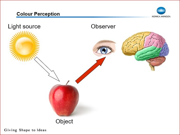
The basis of every visual experience is the eye. Color represents different wavelengths of light that are absorbed by the eyes and converted by the brain. Light can be divided into a spectrum consisting of five different shades:
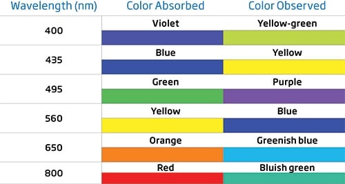
Red color has the longest wavelength, and blue has the shortest wavelength. An object perceived as red absorbs all colors in the spectrum except red light. This unabsorbed light is reflected back from the object into the eyes. From here it travels to the brain and is interpreted as red. The lens of our eyes focuses incoming light onto the retina, which contains two unique types of photoreceptors:
These rods and cones allow us to see color and light, respectively. There are three types of cones:
Other colors are a combination of these three colors. For example, we see an apple and perceive it as red. Some waves are blocked by chemicals in the apple’s skin, but the reflected waves pass through the pupil and excite the cones at the back of the eye. They send a coded message to the brain about the wavelengths entering the eye. The brain translates this code into the sensation of “red.””.
To understand the psychology of color in UX design, it’s important to consider how different colors evoke different emotions in people. We are used to colors being part of our everyday lives, so it is difficult to imagine a situation where they are not associated with various cognitive processes.
Consequently, color perception activates a whole network of these processes. For example, the color red typically attracts attention because it evokes associations such as blood, heat, danger, excitement, warning, and error. Meanwhile, the color green can evoke associations such as nature, calm and hope.
Psychologists classify colors as follows:
However, the difference between warm and cool colors is relative: for example, when comparing red and yellow, yellow is warmer than red. White, black and gray are considered neutral colors. Colors influence both human behavior and physiology.
Specific associations vary slightly at the individual level, but there are certain color-coding meanings that exist as part of culture. There are recognized social encodings for the meanings of colors and their associations. For example, in India, Hindus consider orange to be the most sacred color, while in Zambia, people do not even consider it as a separate color.
Thus, it is important for UX designers to have an understanding of what colors people prefer in a given culture. Color combinations can be associated with certain belief systems and traditions. Thus, the color black has completely opposite meanings in different cultures:
The combination of colors chosen for objects, logos, products, etc. can convey a certain meaning as a result of specific color combinations.

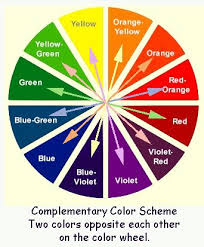
It is important for every UX designer to have knowledge of color theory, including the color wheel and color parameters. The color wheel provides insight into color harmony and which colors can be mixed to create a meaningful visual effect. Color options include:
Colors can direct the user’s attention, and when used correctly, they can create hierarchy. The fewer colors used, the better they will attract the user’s attention. Using too many colors in one design can make the site confusing and confusing, which can lead to unpredictable user behavior, more errors, and decreased profitability.
Cognitive psychologists recommend using no more than five unique colors. Color perception is considered to be the activation of a cognitive unit. Therefore, reducing the number of colors used as coding for information interaction will reduce the cognitive load on the user.
Research has shown that color choice is influenced by the following personality characteristics:
This is one of the most important factors in UX design because choosing the right color for your product will most likely set you apart from your competitors.
The 60-30-10 rule is a theory used by almost every designer to create aesthetically pleasing and reasonably balanced color palettes. This classic rule helps when deciding to create a color palette for a project. It means that 60% of the space should be occupied by the dominant color, 30% by the secondary color, and the remaining 10% by the accent.

UX designers and marketers commonly use color to promote products and advertising. Color is an important component of a brand’s visual identity, and the benefit gained from a brand’s “look” increases brand awareness and image.
Obviously, understanding the role that color plays in marketing is becoming increasingly important as technological advancements advance. The importance and accessibility of color choice is likely to only grow over time.
Notifications